AbstractionThis project is photographs of something which may exist as a thought or maybe an idea, but not necessarily having a physical or concrete existence. The photographer isn't necessarily interested in the subject of the photograph. S/he is more likely to be interested in the Formal Elements. It's as if the object is isolated from the meaning of the picture.
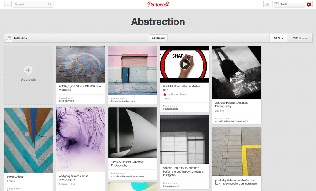
Click the image opposite to take you to the Tallis Arts Abstraction Pinterest board. |
|
The Formal Elements
Focus: The colours and shapes, over lapping appear to be the most clearest in the photograph.
Light: Different parts are darker than the other, shadows the photographer allows you to tell what time of the day it is by the lighting.
Lines: Thick and thin lines around the shape which over laps the background of an area.
Repetition: Theres not a pattern that repeats in the photo just random square and rectangle shapes.
Shape: The edges were all straight because you don't get too see the bottom of the right angle.
Space: There is a large amount of space on the ground in the photo as it appears to be on a roof or somewhere that gives a sky view of buildings.
Texture: If I were to touch the photo I would assume I'd get a fresh of air, wind blowing trees, concrete flooring, tiles, hard surfacing.
Value/Tone: Its an odd pattern of darkness where around 4 shapes are dark green and the rest blend in with in background which is obviously lighter.
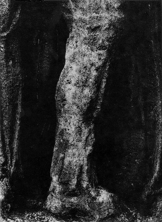
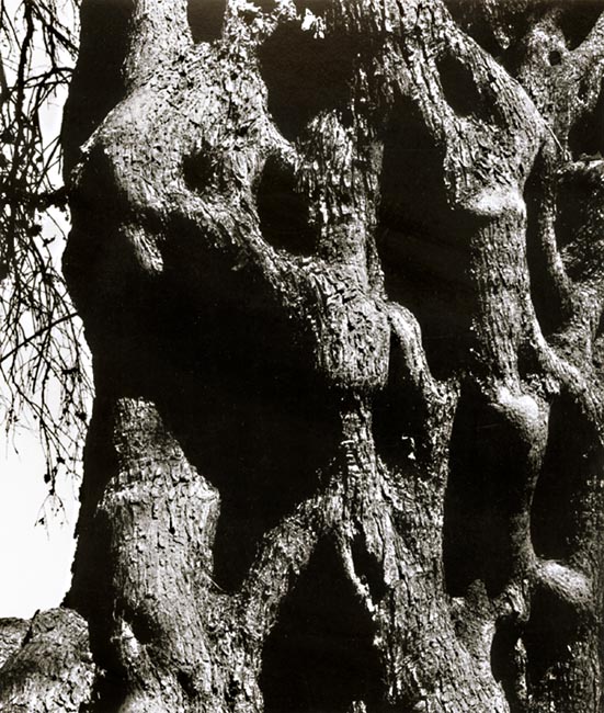
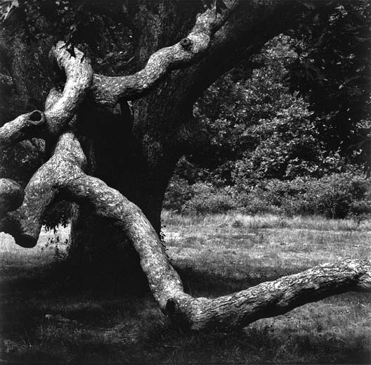
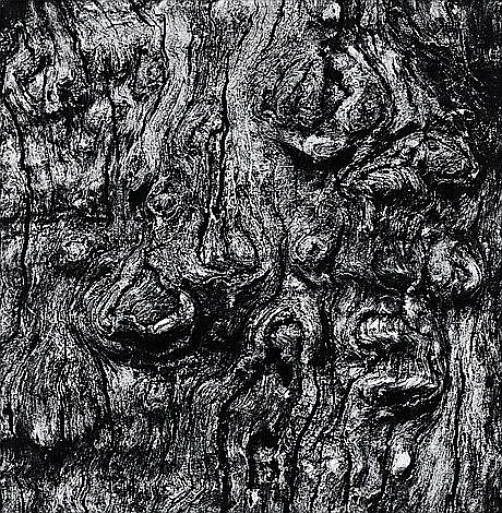
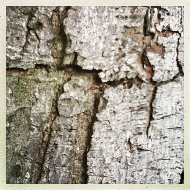
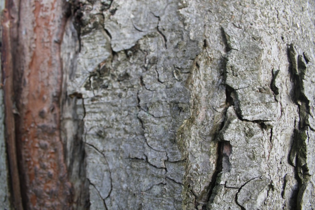
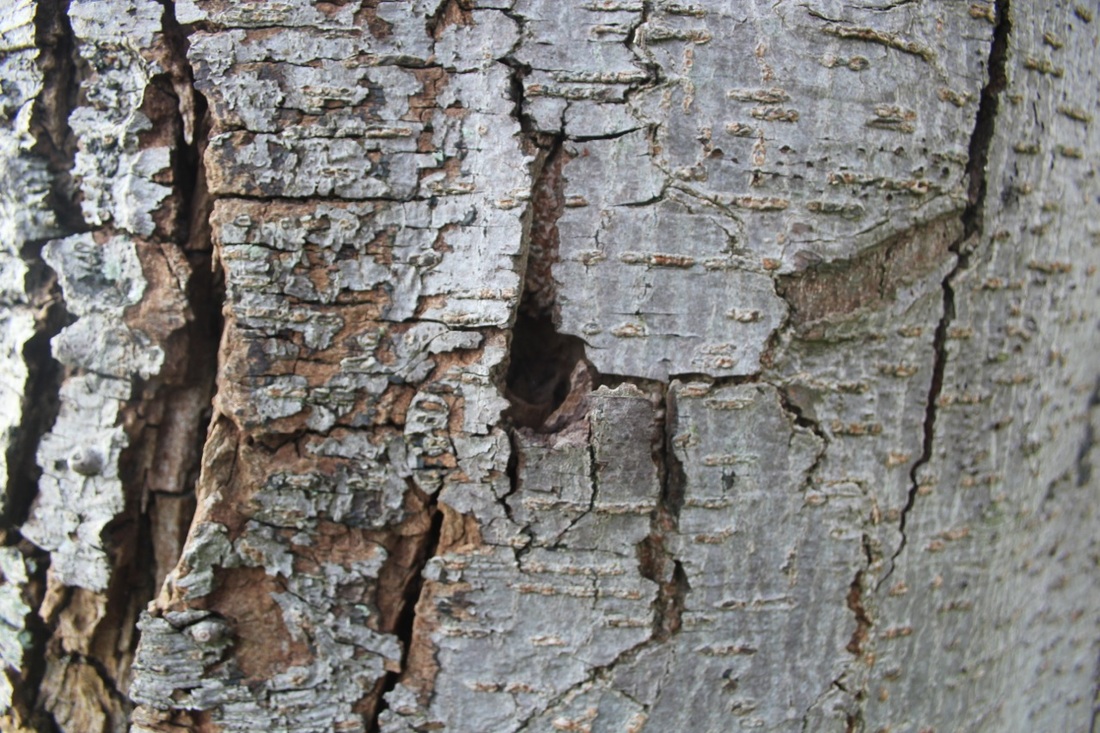
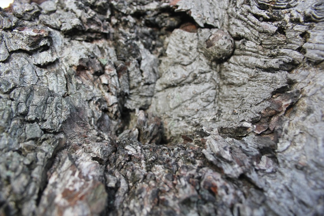
I really like Aaron Siskin'd pictures of trees. He gets really close to the tree trunks so that you can see the pattern of the bark. The light is quite strong in the pictures so there are lots of shadows which is good for showing you the texture of the tree bark. He prints the pictures quite dark which again shows the surface of the wood.
I have decided to make a series of pictures of trees. There are lots on the front field in school. I am going to try to make photos like Aaron Siskind. |
|
My First Set of Images
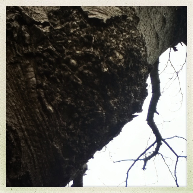
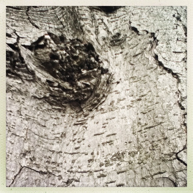
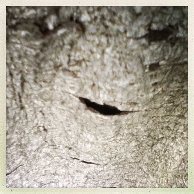
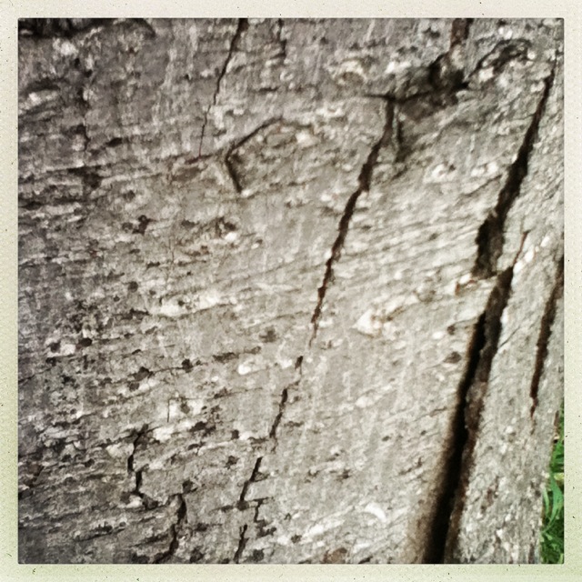
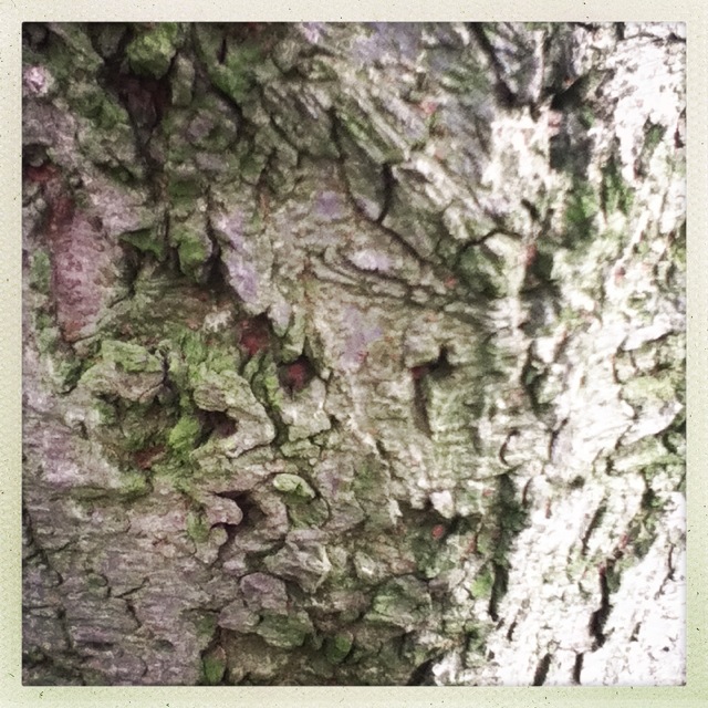
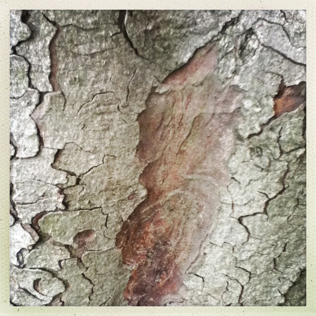
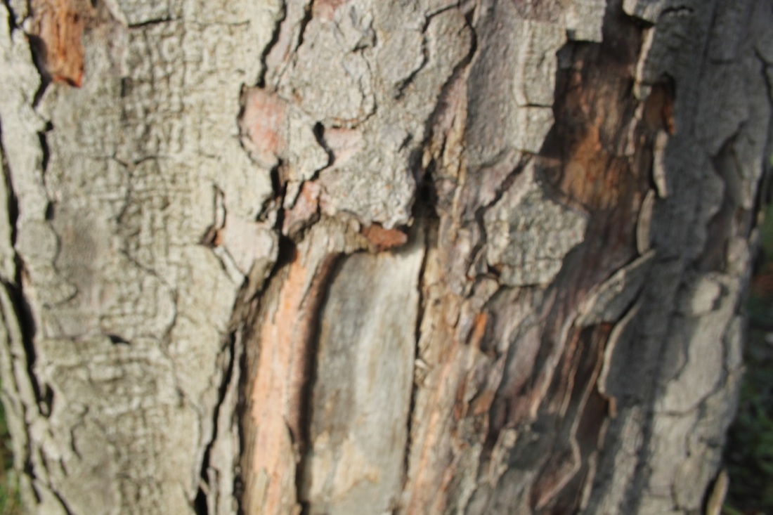
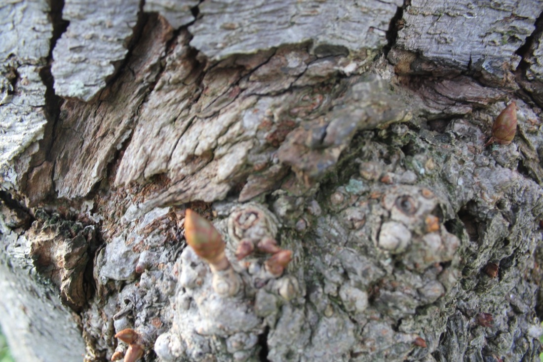
I was interested in the texture of bark on the trees in the school field. I tried to get as close as possible to them. I used an iPhone so sometimes the pictures are a bit out of focus.
My Second Set of Images
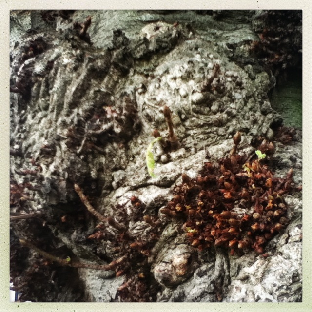
This time I used a DSLR. I think the quality of these pictures is better. You can really see all the different textures of the wood.


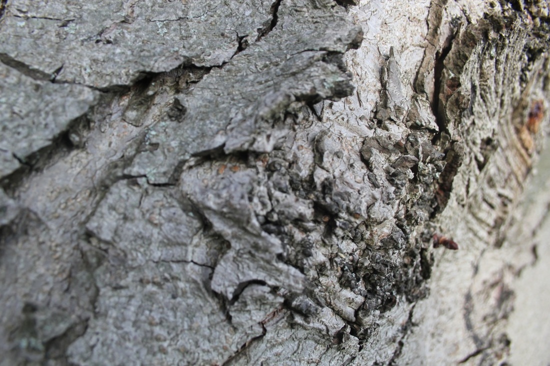
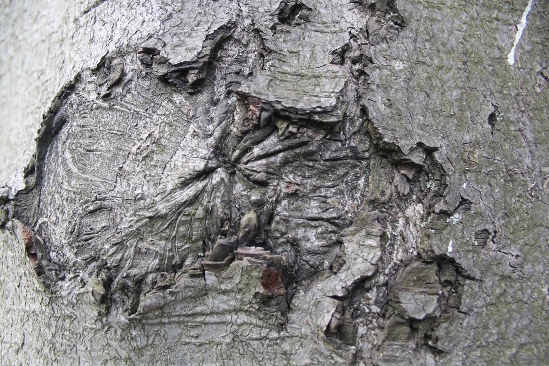
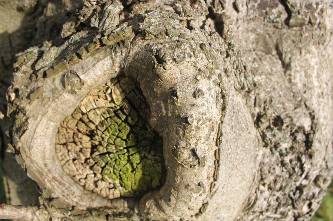
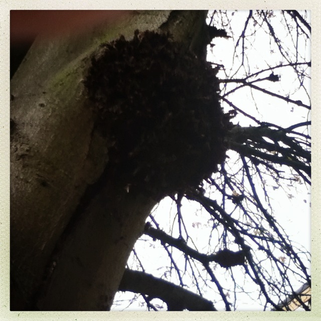
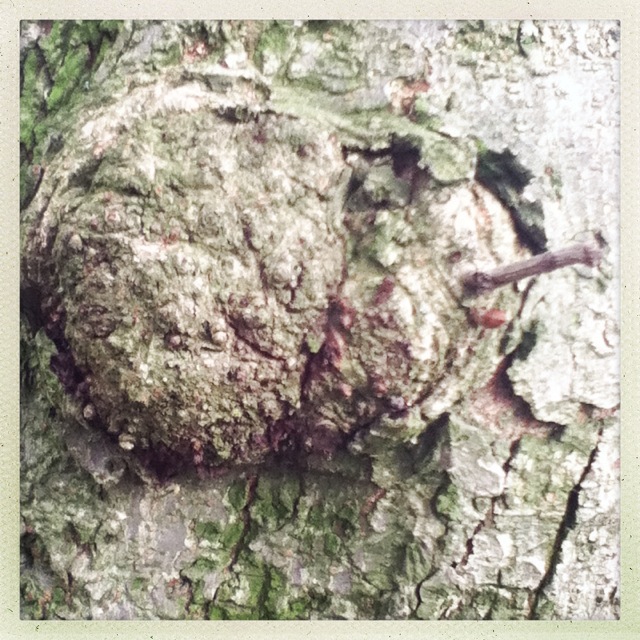
What Went Well...This image was in focus at the time, so everything was captured in the right timing, bold colour in the bottom centre, every bit of detail on the branch is shown from cracks to dirt, made such a good quality when the sun came out. The circled part of this image to me looks like a land/field of grass, also like when your in a helicopters landing and looking whats on the ground, the surface looks very dry and rough. Bitter with no emotion.
Selected Images... |
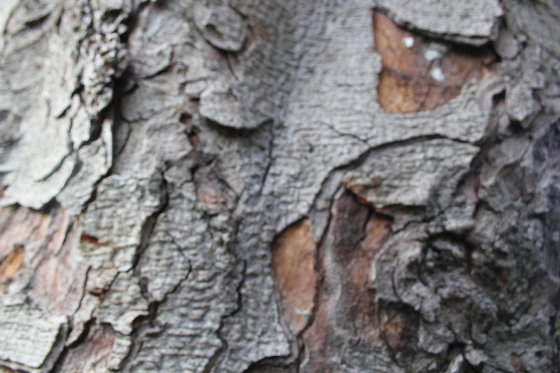
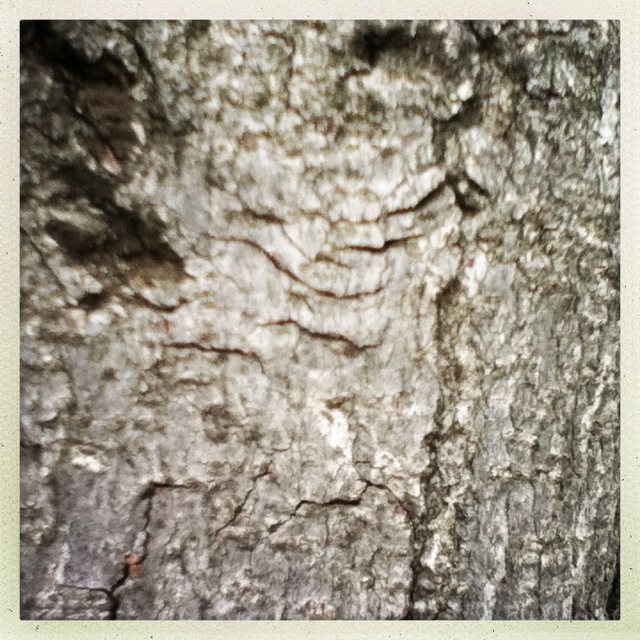
Even Better If...The whole image looks dull and is so out of focus, its all like a big blur, to be honest you wouldn't be able to describe it with the details being accurate. Its a bad idea to be out of focus because pictures are not the same if it's not what you can see in front of you. This image doesn't look professional or even presentable in anyway.
|
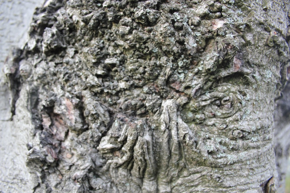
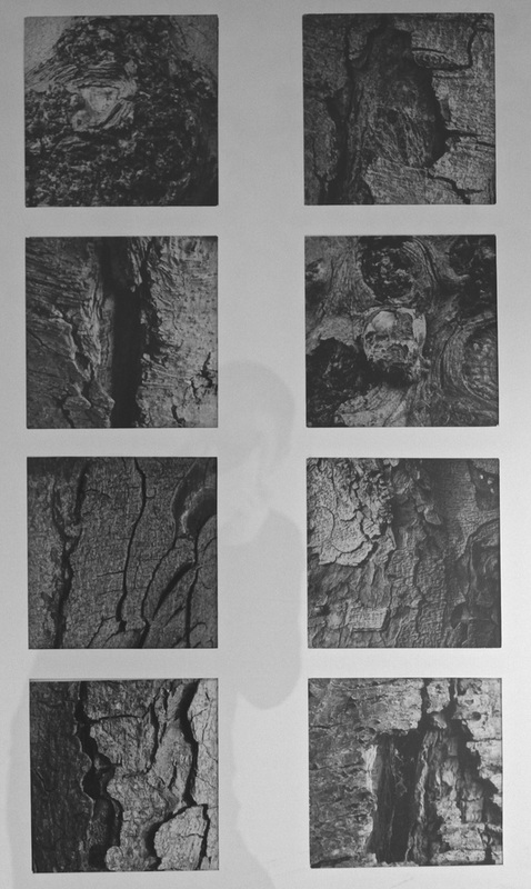
I chose my favourite tree photos and converted them to black and white using iPhoto. I then decided to crop them square like Aaron Siskind's pictures and increased the contrast a little. I then decided to display them on a board in a grid pattern (see below).
|
I am really pleased with the final pictures. They look really good together. Getting close to the trees really worked because you can concentrate on the patterns and textures rather than the shape of the trees. |
|
